Haverhill Brand Heralds New Era for Town
By Elaine Collins on Monday, 23rd October 2006.

Pitched as one of the highlights of the popular Haverhill Festival, the new Haverhill Brand identity and logo were unveiled at the towns Arts Centre on Thursday 29th June.
Commissioned by St Edmundsbury Borough Council and developed by talented local company, The Design Office, the brand concept is the result of several months extensive research and consultation with business and community groups.
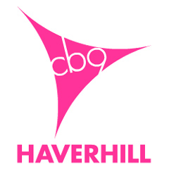
The triangular shape of the brand logo signifies the towns unique position on the borders of three counties - Suffolk, Cambridgeshire and Essex and its proximity to Stansted Airport and the M11. Through direct reference, it also exploits the perceived power of the CB9 postcode. In appearance the logo is lively, modern and friendly, suggests a certain jauntiness and ebullience and has been variously described as zappy and irresistible.
The audience at Thursdays unveiling was shown a video sequence which traces the evolution of the brand concept, exploring its power, potential and proposed use in a series of striking and expressive images of the town and its people.
This brief but compelling film offers a glimpse of the dynamic and of all that is really special about Haverhill. Visual elements combine to foster the impression that the town is open, communicative, enjoys a true sense of community, a first class business culture, vibrant arts and leisure programmes, good educational facilities and faces a bright future. Warmth, resilience, resourcefulness and vigour emerge as key qualities and values.
The message was clear and uncompromising. The role of the brand is to engender pride, galvanise aspirations and build consistent recognition for Haverhill. Its purpose is to promote the town, demonstrating its strengths and vitality as a place to live, study, work, relax and invest in.
Strong hopes were expressed that businesses, organisations and local authorities will align with the brand by using the marque with their own logos when they promote themselves to their individual target markets.
The brand identity has been designed to leverage positive imagery of the town and shape perceptions. To establish itself convincingly it must be used widely as well as consistently. The success of this venture will depend on winning hearts and minds. It is not a campaign that can afford to rely on 'buzz', chance, or merely ticking boxes: it must be inspirational. It has to soar.
The creation of the brand should mark the beginning of an exciting new era for Haverhill.
Visitors cant miss the present underlying energy of the town, despite past and current setbacks. This is the very same energy that fuels initiatives like the Haverhill Festival, the crowning achievement in a year round calendar of arts and events. There is a strong sense that the whole area is undergoing sweeping changes and the town is being thrust more and more into the spotlight.
The new brand sets a seal on this impetus, buoyancy and optimism.
© Gold PR
Gold PR in association with Haverhill-UK
3rd July 2006
E-Mail Link: info@goldpr.co.uk

Comment on this story
[board listing] [login] [register]
You must be logged in to post messages. (login now)


